What’s the future of animation in web design
4 min read
Do you want to stand out from a noisy market of static page designs and templated websites?
We specialise in delivering bespoke animations and brand visuals that turn a static design into a smooth, dynamic visual experience. User engagement is paramount in our digital world, and as such, the role of animation and interactivity has never been more important. It offers a new way to convey information, tell stories, and leave a lasting impression on your audience.
In this article, I’ll break down the formats, benefits and learnings from the many years of experience using animation in the digital space.
What kind of animation do we use?
When I started levelling up our service offering, I focused on the familiar.
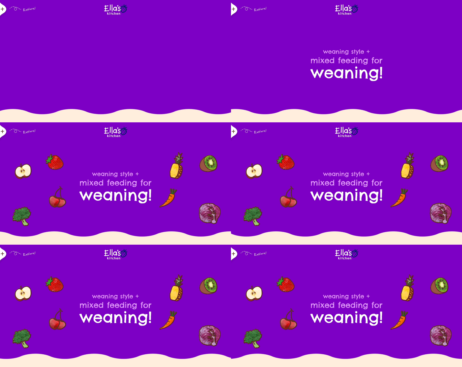
There used to be a time when we were limited to video and GIF files to introduce movement onto a website. Whilst there are still times when a video file is useful, they often come with a hefty file size, which can impact performance and page load times.
SVG (Scalable Vector Graphics)
This file type works great for intricate illustrations, icons, and logos. You don’t have to worry about quality with an SVG, as the artwork is scalable. This makes it great for responsive designs. The code within an SVG file can be used sequentially with CSS, but this often requires some developer knowledge to get the animation working.
Lottiefiles
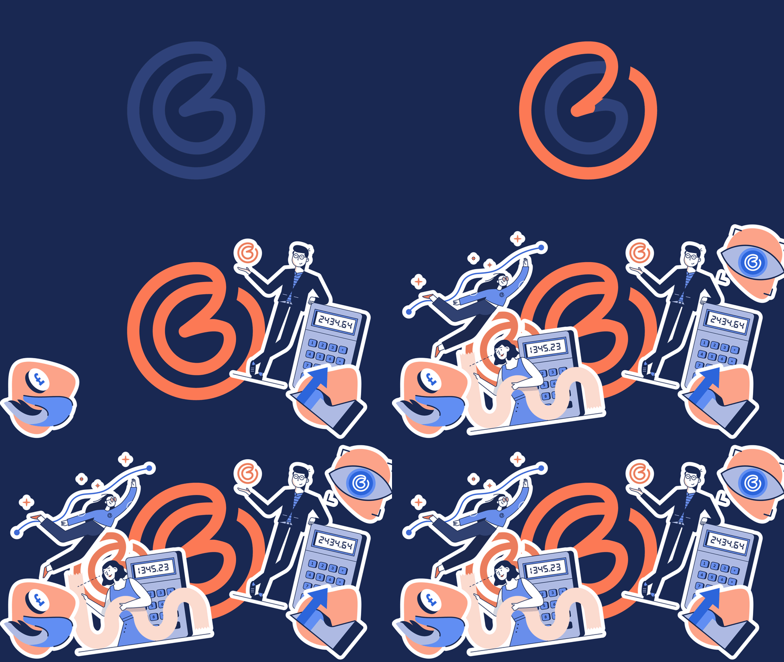
Unlike above, a Lottiefile allows a designer to do most of the groundwork with the animation. This further builds on SVG files but allows you to adjust an animation's timings, movement and individual layers.
There are many ways to experiment with Lottie if you’re new to creating animation within your digital designs. I use an After Effects plugin which takes my pre-created designs and renders them as JSON data. You could also use the web-based animation tool Lottie Creator or a similar platform without downloading a specific programme.

Figma Prototyping
Over the years, we’ve fallen in love with Figma, so much so that it’s become our primary programme for creating digital designs. While other platforms allow you to create prototypes, Figma’s built-in tools work seamlessly together, and it’s easy to pick up and learn the interface. Our prototypes now allow us to showcase a design to our clients with all the bells and whistles you expect from a finished, coded website.
This makes sign-off smoother, as the clients can actually see what the finished product will look like without trying to imagine the movement on a static page. Figma has also recently introduced ‘Dev Mode’, allowing our developers to inspect the designs and copy the relevant code to generate production-ready CSS.
Three.js
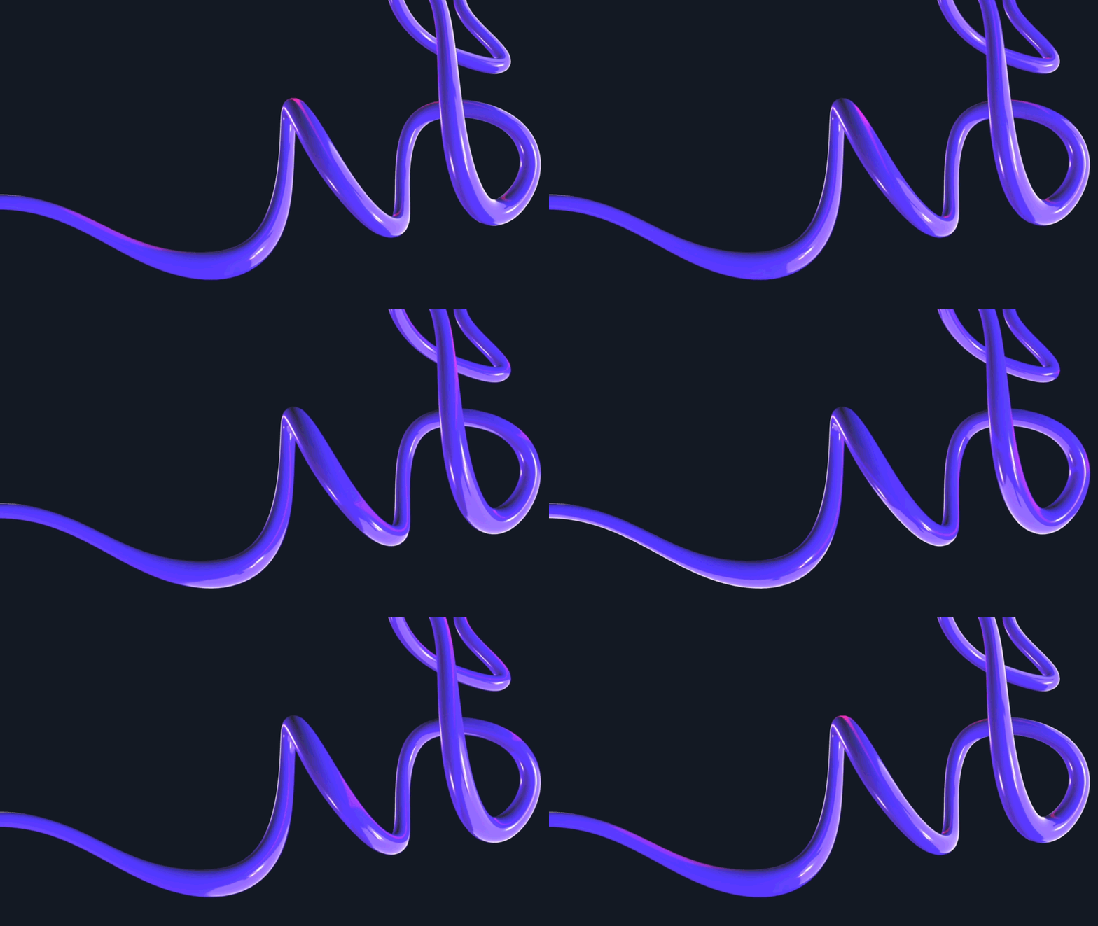
We’ve recently embarked on a journey to learn 3D and implement it within our new and upcoming agency website. It’s been a challenge, but with the help of many Blender tutorials, we created an elegant shape that we then animated with three.js. If you really want your site to surprise and delight, this could be how to do it.
The benefits of using animation
Visual Appeal: Well-executed animations can make a website visually appealing and engaging. Smooth transitions, subtle movements, and dynamic effects can draw users' eyes to different page parts, keeping them interested and encouraging exploration.
Storytelling: Animations can tell a story or guide users through a narrative. You can create a sense of progression or flow by animating elements in a sequence, leading users through the content cohesively and engagingly.
Interactivity: Interactions, such as hover effects or clickable animations, invite users to interact with the website. This can be something as simple as a button that changes colour or size when hovered, reinforcing the user's actions and making the interface feel responsive.
Emotional Impact: Animations can evoke emotions and create a connection with users. Whether it's through playful animations that bring a sense of joy or subtle animations that convey professionalism and elegance, the emotional impact of animations can leave a lasting impression on visitors.
Brand Personality: Animated elements can reflect the personality and tone of your brand. Whether it's playful and whimsical or sleek and professional, animations can help reinforce your brand identity and create a memorable impression on visitors.
Loading Experience: Animated loading indicators or transitions can help mitigate the perceived wait time during page loading, improving the overall user experience.
Mobile Optimisation: With the increasing prevalence of mobile devices, animations can help optimise the user experience on smaller screens by providing visual cues and feedback that are especially helpful in touch-based interfaces.
Competitive Advantage: Websites with well-executed animations stand out from competitors and leave a lasting impression on visitors, leading to increased traffic, engagement, and conversions.
There’s a bigger expectation for websites to be more experiential and surprise and delight visitors, especially when people are used to the experience of an application on their mobile device. Introducing animation to a website levels up aesthetics, experience, and overall understanding.
Abstrakt started as a brand agency, and we really understand a brand-centric approach to web design and proposition. We’re specialists in setting brands apart and use animation as part of our digital brand elevation.

Jamie Robinson
A Creative Lead pushes boundaries by elevating digital identities and innovative technologies such as 3D motion and Lottie.
He has specialist knowledge in digital brands and animation.
Connect on LinkedIn.
How we elevate brands online in action
4.5 min read
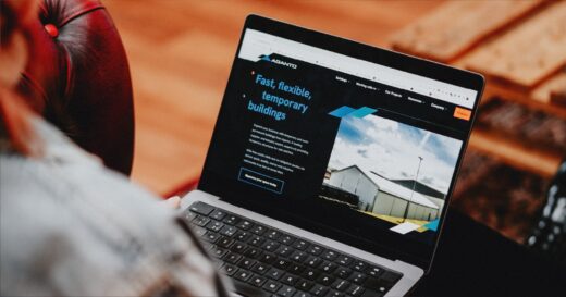
Our approach to design sign off with prototypes
4 min read
