Component-based design systems
4 min read
Revolutionising client relationships one sprint at a time
Starting work with a new agency can be daunting for a client - especially when they’ve historically worked one way with their previous agency for so long.
When we were approached by a new client back in April we knew the task wasn’t going to be an easy one. Their website had been worked on by a number of different designers, developers and content managers over the years; so much so that the website had lost its way a little.
Learning that their previous agency had been delivering full scale plush Photoshop files for each and every template shone the light on the growing issues the website had. That way of working was too isolated and made it harder to make quick iterative changes that would impact the user journey, and clients needs.
What we did
Our answer was simple - we had to introduce a new and more collaborative way of working. A process that would not only change the way we, as an agency worked, but one that suited the entire project team.
We made the shift from Photoshop page-based design to Sketch component-based design earlier this year and we’ve not looked back. Page-based design had us and the client looking at their website as a collection of single templates with very little cross over of design elements. This client especially had the need to change their site regularly and a need to constantly try and test new elements - so this page by page system simply wasn’t a robust enough process.
What is component-based design?
By no means is this a new process - large businesses have been using this digital design process for sometime. The modular design is an approach inspired by Brad Frost's formulated method of Atomic Design, where the theory that everything begins with the smallest element of the interface; “the atom”.

We’re not designing pages, we’re designing systems of components.
Stephen Hay
How we did it
The client needed to command the majority of the elements within their site and see them editable via Craft (their Content Management System.) They also needed components to be shared by a number of pre-existing templates, as the project was more of a refresh and less of a full website redesign.
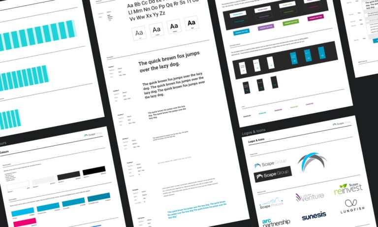
We started at the very beginning and reviewed colour, typography and button styling, to set about a strong initial digital style guide to act as the foundations for our components to build upon. This part of the project saw us create a solid style to work in for accessibility, best practice and rule setting for cross device design.
Initially, in sprint one of the project, we tackled elements via a homepage refresh. Taking the existing branding and content and then flipping it on its head. We restyled news and case study components along with introducing new featured service blocks and a very impactful search interface.
Each element required an overhaul - rethinking typography, buttons, interaction and crucially, implementing stronger CTAs. These components would ultimately be shared sitewide in future sprints so the design needed to be clean and lean for fast paced prototyping and development.
Designing each component in isolation made for speedy client feedback, reiteration and a super quick and stressless sign off process once pages were fully designed. Further sprints saw our components being easily shared across templates with less need to return to design. Once the development components were complete it was easier to replicate them sitewide - making for a happy designer, a happy developer and more importantly, a happy client.

Why it worked
Component-based design is lean, clean and less convoluted to that of a page by page design process. Making this change for the client made for an especially great relationship. As a team, we could be more reactive without the greater impact on project cost or time.
The client saw the benefit in terms of more control over the way their site is designed, built and managed from a content perspective. The agency to client working relationship has also become somewhat seamless when we are updating and testing new elements too.
Not only do we benefit from greater changes in working speed and less technical debt but the client and their brand benefited from greater digital design consistency. This process enabled a number of designers, developers and product managers to delve into the project once we’d packaged it up and passed it on. Continuing to utilise this set design system makes for consistent styling that is sure to stay true to a brand’s identity.
Component-based design has changed the face of digital design at our agency and has hugely improved our working processes - making for better collaboration between design and development and revolutionising the way we work with our clients.
Fancy taking on the challenge of following our design process with your website project? Get in touch with our team to see how component-based design could change the way your website is designed, developed and managed.

Nikki Taylor
Nikki leads our digital projects to guarantee exceptional quality at every step of project delivery with a background in UX design.
She has specialist knowledge in project management and digital design.
Connect on LinkedIn.
Abstrakt's annual (and first!) impact report has landed
2 min read
We have expanded our development team
2 min read

B Corp digital sustainability health check
1 min read
